Pulling the Plug
Saying goodbye to Carousel
December 18, 2014 • 5 Minute Read ∞
I’m sad to announce that today, Mobelux took Carousel (our Instagram client for OS X) down from the App Store and will be discontinuing support on January 1st. It was a tough decision, but one that had to be made. After a 3.5 year run, we’re saying goodbye to one of our favorite products. To those whom supported us with the purchase of a license, either directly through our website or from the App Store, who told a friend about it, who left a review, thank you so much, from all of us. Truly. Carousel was a labor of love and we’ll always be appreciative of everyone that spent a few bucks on the little Instagram app for Mac that could.
And now, for the curious, here are the reasons that we pulled the plug.
![]()
Carousel Icon (2011–2014)
Mobelux is a company that primarily makes software for other people. That means that we know, for the most part, how much it actually costs to make native and web apps from scratch. When we make apps ourselves we don’t make them at cost, partial-cost, or for free. We pay ourselves what it would cost if we charged a client for the work. In effect, an app serves as the client in the relationship and Mobelux the hired development team building it. We don’t think it’s fair to do it any other way. Because of the way we account, Carousel became solvent just this year. We experimented with everything from holiday sales to app bundles, but ultimately determined that the market was not willing to pay more than $3.99 for Carousel, which made it very hard to break even on costs, let alone make a profit. Furthermore, every hour spent put us further in the hole.
Against all financial sense, we updated Carousel over the years to support video posts, Retina Displays, multiple languages, and more. We knew these things wouldn’t vastly expand our market, but they needed to be done in order to remain a good citizen on OS X and the App Store (plus, we just plain loved making it). But, even after being featured by Apple and landing on multiple lists, customer and press interest remained tepid. It made the thought of developing our fully designed 2.0 (which we desperately wanted to do) financially irresponsible.

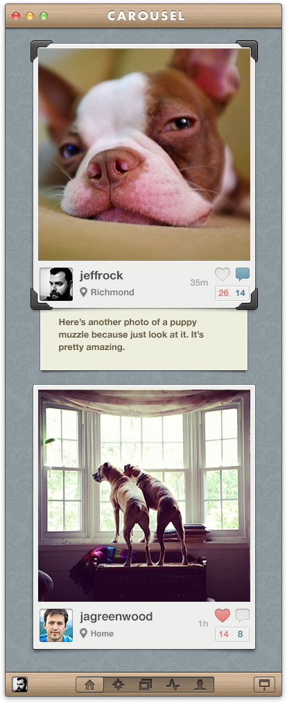
Carousel 2.0 Feed Design
Why was it so hard to market an Instagram app on the Mac? Well, for some, Carousel’s whimsical visual style was a non-starter. We loved the indulgent textures and playful themes we built to compliment Instagram’s filters, but they weren’t for everyone. That wasn’t the real roadblock though. For most, the fact that 3rd party clients like Carousel couldn’t post to Instagram was a real tough sell (imagine marketing a Twitter app that couldn’t let you post a tweet). With that harsh reality in mind, we decided that we couldn’t justify investing in a 2.0 unless we had the ability to post to Instagram. As unlikely as that idea seemed, there was actually some hope that it was possible.
Back in 2012 (and against all odds), we watched a floundering Hipstagram broker a relationship that allowed them to post to Instagram from the app. It wasn’t a URL scheme or an “Open In” hack, it was a true API call. We got excited. It meant that they were finally allowing other apps to post to their platform on a case-by-case basis. So, in mid-2013 I sent an email off to the Instagram founders, laying out our predicament, and asking for the chance to be whitelisted. After about a week I got a response from one of Instagram’s co-founders:
“(W)e won’t be supporting uploads from the desktop, since mobile uploads are so core to what people expect on Instagram.”
That email effectively ended our development roadmap. It was a heartbreaker, but to be clear, this was completely fair of Instagram, even if it was tough to hear. It was the Instagram tracks that we had built our railcar on and they were making decisions that they felt were good for their business. Now it was time to make a decision that was good for ours.
I once worked with a guy a that had a sign posted above his desk. It read, “Kill Your Darlings”. When I asked him what it meant, he told me that you should never fall in love with the things you create. That sentence you’re so proud of? That overworked UI interaction? They make it difficult to make decisions for the health of a product because you end up focusing on the parts you’re enamored with instead of the whole. They keep you from severing the rotten limb that threatens the health of the tree.
Carousel had become our darling. We kept it going because we all loved it so much. But without the ability to post, we would never have a product that could become profitable, and would most likely continue to leach resources from Mobelux over time. We made a decision. The year Carousel became solvent we would shut it down. Sometimes you have to let something go no matter how much you love it. And when you do, those resources can be freed up to go in other directions, toward strengthening the team, and creating new opportunities.
All that said, I’ll still miss working on our favorite little projector.
